Monday, April 10, 2017

Creative Concepts 1: Final ISA

You are designing a billboard for a local salon that offers Henna Tattoos. The subject of the design is the shop's Spring promotion.

The headline is "Spring Colours!"

Your billboard design must include the name of the shop, their logo, their phone number, website and street address. NOTE: We are simply using these shop names as a framework for the assignment. You should make up everything else if necessary. Create a fake logo, website address, etc. since they probably don't exist.

There are several salons in the Hamilton area to choose from at this link It doesn't matter if the shop is a real one, however, you can make up the shop name and info if you like).

Also include the line "Gift cards starting from $100"

Your visual elements must include (but are not limited to) one face (or part of a face) and two hands. You may include other parts of the figure or any other props, scenery, decorative elements that suit your design concept. Your design must include elements that suggest a Spring theme.

* I showed you some examples of work by Al Parker, Mike Ludlow and Dorothy Monet in class.

Submit the following:

A page of "Brainstorm Sketching" (show basic shape construction, stickman skeletons, facial proportioning, etc. as well as typographic exploration) as in the examples below.


This one page goes in the In-Class Sketches: ISA #3 Brainstorm Sketching drop box. Use the naming convention LPeng_Hennabrainstorms.jpg (replace my name with your own)

* NOTE: Meaningful exploration/sketching of typefaces/styles is also required to get full marks on this section.

Submit the first page described below to the Sketchbook 12 drop box. Use the naming convention LPeng_HennaThumbs.jpg (replace my name with your own):

A page of thumbnails (4 minimum) correctly oriented and the correct proportion for a billboard.


Submit the page described below to the ISA #3 drop box. Use the naming convention LPeng_HennaComp.jpg (replace my name with your own):

Your full-size pencil comp showing image area for a billboard-shaped ad, guidelines for all typography, construction for all visual elements.


Late submissions can be uploaded until 11:59 pm on the day we would nornmally have class during Exam Week, but will receive a 20% deduction.

Friday, April 7, 2017

Creative Concepts 2: Final ISA

You are designing a mobile app for the Art Gallery of Hamilton.

The purpose of the app is to allow visitors to enjoy a comprehensive self-guided tour of the gallery. When a user opens the app on a smartphone or tablet and holds it in front of any artwork or location in the gallery, a guide's voice will be heard and related text will appear on the screen.

BRAINSTORM SKETCHES: fill a spread (two pages) in your sketchbook with whatever you saw at the art gallery during our field trip. Sketch artworks, people, architecture and early stage ideas for your app screen designs (UI or User Interface)

Here are a few examples from last year's field trip:


The two brainstorm sketch pages go in the Sketchbook Thirteen dropbox.


THUMBNAIL STAGE: You are designing four thumbnails - the front page (or opening screen) of the app, plus three other 'views' a visitor might typically see, based on your sketches and photos from our field trip to the AGH.

Two of your screen designs should be of artwork you saw in the gallery.

The other two screens should be of locations in the gallery sketches in two-point perspective. Include at least two people (or more if you like) in each of the location views.

You can use any of your preferred sketches for the opening screen - location or art sketch - or use more than one image if that's where your creativity takes you. here are some examples of work done by students last year:


As in the examples above, your thumbnail designs should include branding (the AGH logo) as well as text/type relevant to the content of each screen image. For example, if the screen image is a location, the text should describe that location and (possibly) where it leads. If the screen image is a piece of art, the text should include the artist's name, the title and the date of the piece.

Visit the Art Gallery of Hamilton website to gather information you may want to include in your screen designs.

The template below is a 'frame' for your four thumbnail sketch designs.


This page of thumbnail sketches goes in the ISA #3 dropbox.


Final Concept Sketch:

For the final concept sketch, draw a full page view of someone using your app in a gallery setting. The view of the gallery should be in two point perspective, as in this example sketch shown below:


Show a minimum of two people in your setting, one being the app user:


Showing more than two people would be even better!


Add titling information to your sketch:


All text elements must be hand-drawn. DO NOT use computer generated type.


This concept sketch page goes in the ISA #3 dropbox.


Contact me with any questions or if you need further clarification.

Thursday, March 23, 2017

Week 10/11: Sketching Type Creatively

PART 1

Read this article about Herb Lubalin.

Google Image Search Herb Lubalin's logo designs.

Look specifically for "Beards" , "Mother & Child" , "Families" and other Lubalin "typographics"

Beards

Design a "typographic" version of the logo you have recently worked on for Cindy's Typography class. Begin by doing a page of brainstorming roughs - brainstorm at least four different typo-graphic ideas. Then comp up the best one.

PART 2

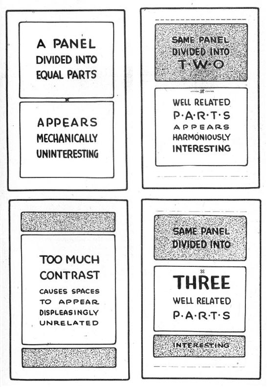
Study these layouts below and consider what they are telling you about how to organize a good vs. bad layout.


This week's sketchbook assignment: Read Frank Chimero's Advice for Graphic Design Students

Choose a section that really speaks to you and sketch a layout design that demonstrates the lessons learned in today's in-class exercises. Use both typography and visual elements - typo-graphically - as creatively as possible!

Monday, January 9, 2017

CC2, Project One: Letterforms in Your Environment

It's essential for graphic artists/designers to do 'field research' - to observe and examine the real world around them rather than relying on the internet as their primary research and inspiration tool. We'll be doing several assignments this semester that will require you to do 'field research' as the first stage of creating and executing a design.


Letterforms are all around us if we just take the time to look closely AND creatively at our world.

WEEK ONE:

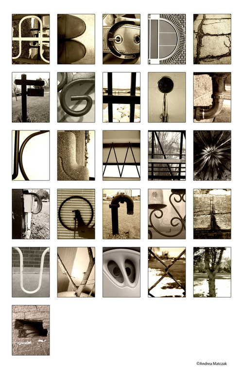
Here's one example of an environmental letterform alphabet. And here's another.


During Week One of CC2, take the three hours of our class time to examine everything around you, large and small. Look at furniture, room details like door and window trim, kitchen utensils, tools, bikes, cars, buildings and fences. Go to the hardware store and look at all the items there. Look at the trees and other plants in our landscape. Look at shadows.

Every time you spot what looks like a letterform somewhere in our environment, take a photo of it. Save it in black & white mode if possible.

Once you've managed to photograph the entire alphabet, organize the photos into a grid similar to the examples at the link above. Save the 26-letter assembly as a jpeg and upload it to the Week One sketchbook dropbox.


WEEK TWO:

Print out the page and bring it with you to class in Week Two. We will post everyone's field research on the board and look at them together.
NOTE: there is a 20% penalty for not bringing in the printed-out field research so DON'T FORGET!

Over the next three weeks we will be working toward creating a full-size, hand-drawn letterform alphabet poster. Here are a couple of great examples of previous student work:


In class during Week Two you will begin conceptualizing the design of your poster by researching and thumbnailing. We will begin experimenting with tonal shading techniques so be sure to bring pencils - including the flat pencil from your art kit - erasers, pencil sharpeners, a sharp knife and your grey markers from the art kit.

Once your thumbnail designs and pencil/marker comp are completed in your sketchbook, upload them to the Week Two sketchbook dropbox. At the end of our Week Two class I will be handing out large sheets of plain white paper on which you will execute the final version of your Letterforms in Our Environment Alphabet poster design.

WEEKS THREE & FOUR

We will devote our class time during Weeks Three and Four to completing the full size poster. The finished artwork is due by the end of class in Week Four.

Monday, October 31, 2016

CC1, Weeks 8 & 9: Independent Study Assignment #2

Your second Independent Study Assignment will take place next week, however you can begin immediately if you prefer. It would be advisable to not wait until that day to begin! NOTE that we do not meet in class during an Independent Study Assignment.

The assignment is to redesign the cover of an existing video game. Your new design must incorporate a montage of figures and heads. For example, here is an existing video game cover...


There are four parts to your 2nd Independent Study Assignment:

1.) a page of rough, exploratory sketching (Goes in the Week 9 Sketchbook dropbox)


2.) a minimum of four thumbnails (Goes in the ISA #2 dropbox)


3.) a full size pencil comp (Goes in the ISA #2 dropbox) NOTE that the design is now a montage of figures and heads.


4.) a jpeg of the actual existing video game box cover (Goes in the ISA #2 dropbox)


You must submit all pages to the correct dropbox(es) PLUS the existing image - four files all together - in jpeg format only - do NOT zip your files

Remember:

* Draw the image area to the correct proportion.

* Draw guidelines for all typographic elements.

* Leave construction lines in place so I can tell you are using the stickman construction method when drawing figures and the proportion method when drawing faces.

Tuesday, April 12, 2016

Week 13: Exercises and Sketchbook Assignment for those who missed the field trip

Here are some of the paintings we viewed at the AGH. Choose one to sketch from. Use the whole page - include values (shading).


Week 13 Sketchbook Assignment: Visit the AGH website at this link. Redesign the landing page to reflect a more modern, clean design as in these examples and feature one of the paintings above in your redesign.

Upload both pages to the Week 13 Sketchbook dropbox.

Tuesday, January 19, 2016

Drawing Objects in Perspective

Sketch all the objects below in your sketchbook


This Week's Sketchbook Assignment: Find an online home furnishing flyer (eg. ikea.ca) and choose a room setting in two point perspective (eg. a living room or dining room) Sketch the scene but include three people using the furniture (sitting, standing, leaning on something, etc.)