Read this article about Herb Lubalin.
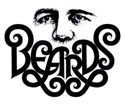
Google Image Search Herb Lubalin's logo designs.
Look specifically for "Beards" , "Mother & Child" , "Families" and other Lubalin "typographics"
Design a "typographic" version of the logo you have recently worked on for Cindy's Typography class. Begin by doing a page of brainstorming roughs - brainstorm at least four different typo-graphic ideas. Then comp up the best one.
PART 2
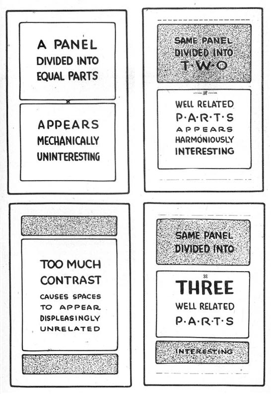
Study these layouts below and consider what they are telling you about how to organize a good vs. bad layout.

This week's sketchbook assignment: Read Frank Chimero's Advice for Graphic Design Students
Choose a section that really speaks to you and sketch a layout design that demonstrates the lessons learned in today's in-class exercises. Use both typography and visual elements - typo-graphically - as creatively as possible!


No comments:
Post a Comment