Friday, November 28, 2014

Week 14: ISA #3:Henna Tatttoo Billboard

You are designing a billboard for a local tattoo shop or salon that offers Henna Tattoos.. The subject of the design is the shop's Christmas promotion.

The headline is "Christmas Decorations!" (if you choose a different seasonal holiday, replace "Christmas" with the name of the other seasonal holiday)

Your billboard design must include the name of the shop, their logo, their phone number, website and street address. NOTE: We are simply using these shop names as a framework for the assignment. You should make up everything else if necessary. Create a fake logo, website address, etc. since they probably don't exist.

There are many tattoo shops (Google "tattoo shops near me") and several henna salons in the Hamilton area to choose from at this link It doesn't matter if the shop is a real one, however, you can also make up the shop name and info if you prefer).

Also include the line "Gift cards starting from $100"

Your visual elements must include (but are not limited to) one face (or part of a face), one (or more) hands. You may include other parts of the figure or any other props, scenery, decorative elements that suit your design concept. Your design must include elements that suggest a Christmas (or other seasonal) theme.

* To inspire your creative thinking, here are some examples of work by Al Parker, Mike Ludlow and Dorothy Monet in class.

Submit the following:

1.) a page of rough sketching* (show basic shape construction, stickman skeletons, facial proportioning, etc. as well as typographic exploration).


This one page goes in the Week 13 In-Class drop box. Use the naming convention LPeng_ISA03_Brainstorms.jpg (replace my name with your own).

* NOTE: Meaningful exploration/sketching of type faces/styles is also required to get full marks on this section.

Submit the next page described below, to the Week 13 sketchbook drop box:

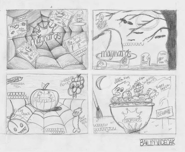
2.) A page of thumbnails (4 minimum) correctly oriented and the correct proportion for a billboard. Use the naming convention LPeng_ISA03_Thumbs (replace my name with your own).


Submit the next page described below, to the ISA #3 drop box:

3.) Your full-size pencil comp showing image area for a billboard-shaped ad, guidelines for all typography, construction for all visual elements. Use the naming convention LPeng_ISA03_Comp (replace my name with your own).


Monday, November 24, 2014

Week 13: Sketching Type

Hour One:

You will need your sketchbook. Work either vertically or horizontally.

Divide the page into nine equal spaces.

You may use a ruler to draw the grid that divides the space into nine equal sections.

Now look for man-made objects in your surrounding environment that contain letterforms. NOTE: Do not simply copy a letterform alphabet from the internet - any images copied from online sources will receive a zero.

Draw one letterform in each space. The page should look something like this:


After drawing the object in line, use pencil shading to add values to each letterform composition. Complete the 9 letterforms during hour one of this week's class.

Hour Two:

Read this article about Herb Lubalin.

Google Image Search Herb Lubalin's logo designs.

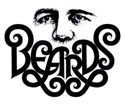
Look specifically for "Beards" , "Mother & Child" , "Families" and other Lubalin "typographics"

Beards

Choose one of the letterforms you found and sketched during Hour One. Design a "typographic" logo that visually describes the subject in which you found that letterform. (Eg., if you found the letterform in a door, design a "typographic" logo for the word "Door."


Week Thirteen Sketchbook Assignment: Take a picture of someone else's typographic and redesign it. Submit both their version and your version to the Week Thirteen Sketchbook dropbox.


Monday, November 17, 2014

Week Thirteen: Drawing Hands, Part 2

This week we'll expand on last week's lesson by exploring how to construct and draw realistic hands in a variety of positions.

Begin by watching this tutorial. In your sketchbook, draw along with the artist.


Some good reminders about hand construction at the top of this tutorial


Study these hand construction examples and try drawing them as shown. (You don't have to do the final shading stage - just the construction)


Here's a long, very comprehensive tutorial. There's a lot of excellent info in it, but it's a slow-moving tutorial. If you're interested in studying hands further, you might want to watch (and draw) in chunks:


Week Thirteen Sketchbook Assignment: Sketch three of the hands below demonstrating the construction method we learned in class today.


Monday, November 10, 2014

Drawing Hands, Part 1

Part 1)

On a new page in your sketchbook, draw a one inch border and complete all four steps as described in the top section of the page below.


Part 2)

On a new page in your sketchbook,, and using the same construction process as you did in Part 1, draw all the hands in the lower section of the example page. DO NOT erase your construction lines!


Week Eleven Sketchbook Assignment: Choose three hand positions from the many described above, draw both the cartoon version and your own realistic hand in the same position. Draw all six sketches on one page in your sketchbook.

Monday, November 3, 2014

Week Nine: Drawing All Types of Faces


If you missed this week's class, you will need to use two pages in your sketchbook. Draw a one inch border divide the space inside the image area into six equal quadrants, as in these two photo page examples. Using the sample sketches above as your guide, draw the woman in the first frame in a very simple style, the woman in the second frame with slightly more detail, the woman in frame three with lots of realistic detail. Repeat with the second row.


Repeat the process on your second sheet of paper, this time drawing the men's faces in sequence as you did with the women's faces.


Week Nine Sketchbook Assignment: Have a look at this drawing. Draw yourself in the same three positions, transforming into the Hulk!

If you missed this week's class, upload all three pages to the Week Nine Sketchbook dropbox. If you were in class this week, upload only the sketchbook assignment.

Monday, October 27, 2014

Week Ten: Further Study of the Drawing the Head in Correct Proportion

This week we are drawing two pages, one showing the male head from front and side views...

...and one showing the female head from front and side views.


Begin with an 8 1/2 x 11 inch sheet of white paper turned horizontally in front of you on your drawing table. As always, draw (freehand) a 1" border all the way around the page and hand-letter your name between guidelines at bottom right.
Again, working only freehand, sketch a circle in the top LH quadrant of the page as shown. The exact size and placement isn't important. Just try to approximate what you see in this example. Lightly draw guidelines dividing the circle in half both vertically and horizontally.
Extend vertical guidelines down from both sides of the circle, allowing them to taper inward slightly as shown. Extend the centre guideline down as well. Using the half circle as a unit of measure, lightly mark a guideline below the circle so that you have three equal units in height. This is the total height of the head, from the top of the skull to the chin.
Lightly sketch in guidelines 1/3 of the way down from the top of each unit of measure as shown. Note that each guideline represents a landmark on the face, from the top of the head to the chin. Important:Note that the centre horizontal line of the circle if the brow line, NOT the eye line, which is 1/3 below the brow line. Also note the bottom of the circle is the bottom of the nose and that the mouth is 1/3 the distance to the chin - not halfway!
Here's a little trick: if you draw five equal sized ovals touching end to end across the width of the circle on the eye line, the second and fourth ovals are the correct size and shape for the eyes.
Lightly draw guidelines straight down from the centre of each eye to arrive at the corners of the mouth. This is how you establish the width of the mouth.
Since we are drawing a male head, do NOT draw the lips all the way around! Look at how I drew the line for the opening of the mouth and try to mimic it. Add just a sketchy line under the mouth. this represents the shadow under the bottom lip.
Draw a triangle from the centre point of the eye line to the corners of the mouth. point where the sides of the triangle cross the nose line (the bottom of the circle) represent the width of the nose.
Also note how I have drawn angled lines from the side guidelines at around the mouth line to complete the chin. On a male face, always use angled lines, not smooth curves.
Try to draw the nose in the manner shown. A dip in the centre, slight upwards curves for the nostrils, then curved verticals for the outsides of the nostrils.
Extend the eye and nose guidelines outward a bit at both sides of the head. This gives you the height of the ears. Draw a shallow "C"- shaped curve for the outside shape of the ear.
Try adding the interior ear lines as I've indicated. You can now heavy up the eyebrows 9use angular lines as shown) and the top lip and bottom lip shadow, also as shown.
Now extend all the horizontal guidelines across to the right side of the page.

To draw the head in side view as show at the top of this page, follow the instructions at this link

Week Ten Sketchbook Assignment: Sketch a self-portrait in both front and side views as shown in the two sheets at the top of this post.

If you were in this week's class, submit jpegs (DO NOT ZIP THEM!) of the drawings you did of the two members of your group PLUS the self-portrait sketch to the Week Ten Sketchbook dropbox. If you missed this week's class, submit the two pages at the top of this post PLUS the self-portrait sketch to the Week Ten Sketchbook dropbox.

Thursday, October 23, 2014

Week Eight: ISA #2

Note: The deadline for submission without mark deduction is extended to the start of your class time the 2nd week AFTER we return from break. (Submissions the week after that will be docked 20%)

You are redesigning an existing video game cover (or alternately, an online game website homepage) that features 'realistic' proportioned characters. In other words, a SuperMario-type of game would not qualify for this assignment because the characters are too cartoony and not realistically proportioned. Animal characters would also not qualify, however a human/animal or alien type character would qualify if they are 'realistically' proportioned. You may show alternate characters to the ones currently featured on the existing game.


You will be submitting four jpegs (individually - do not zip them):

1. A jpeg of the existing game cover design.

2. A page in your sketchbook of rough sketching/conceptual thinking/doodling of characters, props, environments and possible typography.

3. An 8 1/2" x 11" sheet with a 1" border and your name in block lettering in the bottom right corner (use guidelines) showing four thumbnail sketches. (You may do more than four thumbnail sketches but will lose marks for fewer than four)

4. An 8 1/2" x 11" sheet with a 1" border and your name in block lettering in the bottom right corner (use guidelines) showing a full size pencil comp of your best design based on the thumbnail sketches.

Here are some examples of excellent work from ISA #1. Work of this quality will receive full marks:

Sketchbook roughs:


Note that the sketchbook page is filled with rough design work covering a great variety of ideas. Pages that have just a few sketches and little effort will lose marks.

Thumbnail sketches:


Note that the design and subject matter of each thumbnail is genuinely unique. Logos and typography show variety in size and placement. Subject matter shows variety. Guidelines are evident throughout. Greeking is being used for small type elements.

Pencil Comp:


Note the degree of comprehensiveness. Type elements and subject matter are carefully sketched. Guidelines are evident. The final designs are creative and distinctly different from what was already existing.

Pages 1,3 and 4 go in the ISA#2 dropbox.

Page 2 goes in the Week Eight Sketchbook dropbox.

Tuesday, October 14, 2014

Week Seven: The Head and Figure in Correct Proportion

*Note: This week's in-class assignment has two parts.
Part 1: Drawing the Head by Construction
Begin with an 8 1/2 x 11 inch sheet of white paper turned horizontally in front of you on your drawing table. As always, draw (freehand) a 1" border all the way around the page and hand-letter your name between guidelines at bottom right.
Again, working only freehand, sketch a circle in the top LH quadrant of the page as shown. The exact size and placement isn't important. Just try to approximate what you see in this example. Lightly draw guidelines dividing the circle in half both vertically and horizontally.
Extend vertical guidelines down from both sides of the circle, allowing them to taper inward slightly as shown. Extend the centre guideline down as well. Using the half circle as a unit of measure, lightly mark a guideline below the circle so that you have three equal units in height. This is the total height of the head, from the top of the skull to the chin.
Lightly sketch in guidelines 1/3 of the way down from the top of each unit of measure as shown. Note that each guideline represents a landmark on the face, from the top of the head to the chin. Important: Note that the centre horizontal line of the circle if the brow line, NOT the eye line, which is 1/3 below the brow line. Also note the bottom of the circle is the bottom of the nose and that the mouth is 1/3 the distance to the chin - not halfway!
Here's a little trick: if you draw five equal sized ovals touching end to end across the width of the circle on the eye line, the second and fourth ovals are the correct size and shape for the eyes.
Lightly draw guidelines straight down from the centre of each eye to arrive at the corners of the mouth. This is how you establish the width of the mouth.
Since we are drawing a male head, do NOT draw the lips all the way around! Look at how I drew the line for the opening of the mouth and try to mimic it. Add just a sketchy line under the mouth. this represents the shadow under the bottom lip.
Draw a triangle from the centre point of the eye line to the corners of the mouth. point where the sides of the triangle cross the nose line (the bottom of the circle) represent the width of the nose.
Also note how I have drawn angled lines from the side guidelines at around the mouth line to complete the chin. On a male face, always use angled lines, not smooth curves.
Try to draw the nose in the manner shown. A dip in the centre, slight upwards curves for the nostrils, then curved verticals for the outsides of the nostrils.
Extend the eye and nose guidelines outward a bit at both sides of the head. This gives you the height of the ears. Draw a shallow "C"- shaped curve for the outside shape of the ear.
Try adding the interior ear lines as I've indicated. You can now heavy up the eyebrows 9use angular lines as shown) and the top lip and bottom lip shadow, also as shown.
Now extend all the horizontal guidelines across to the right side of the page.
Draw another circle on the right side in the same position as the one you first drew on the left side. This time when you extend guidelines down on both sides of the circle, taper them in a bit more, as shown.
repeat the facial construction steps you used on the male face, as shown.
Notice the female eyebrows are curves, not angles, the eyelashes are long, elegant curves, the lips are drawn all the way around (top lip is a bit smaller than the bottom lip) and the chin is one long curve, no angles.
Finish the eyes, ears and nose as shown.

Part 2: Drawing the Body by Construction
Begin as always by drawing a freehand border 1" in from the outside. This time we're working vertically. Don't forget to hand-letter your name in the lower RH corner as shown.
Draw a straight line (freehand) that goes nearly from the top border to the bottom border, as shown. You'll need to divide the line into eight equal units so begin by visually locating the centre point and lightly sketch a mark there.
Now divide the two equal units in half, creating four equal units.
Now divide the four, creating eight equal units.
Each of these eight units represents a landmark on the body, from head to toe. Draw guidelines across the page and mark off each guideline as shown. Draw a new vertical line on the RH side of the page. this will represent the centre of the body.
In the top unit, draw the head using construction measurements from Part 1. (No need to add details of the face)
Use the width measurement of the head to arrive at the total width of the entire form. Add the width of the head again to either side of the head and draw guidelines all the way down to the base line of the figure.
Measure in approximately 1/3 of one head width on the left and the right and draw guidelines to the base of the figure. measure down approximately 1/3 of the distance from the chim to the nipples to establish the shoulder line.
Locate the navel on the navel line, then draw a triangle to the corners of the shoulders. As the two sides of the triangle pass across the nipple line, they provide the location of the nipples. Darken the centre line from the crotch to the base line. This establishes the two leg shapes. Add the knee caps and ankles as shown.
Begin breaking down each unit with ovals as shown to establish the general shapes of each body part.
Refine and connect all the body parts as shown.

Week Nine Sketchbook Assignment: Using the information you learned in this week's exercises, draw a full standing (clothed) figure of anyone you like, real or imaginary. Indicate the measurements to one side of the figure as in the exercise. Label all the proportions as in the exercise. Show all construction lines as in the exercise - THEN draw the clothing over top. DON'T erase the underdrawing!