Monday, October 29, 2018

Week Eight: Drawing the Head in Proportion

Your in-class (work-at-home) exercise for this week is to complete sketches of the human head in correct proportion. Your finished sketches should look like this:


Please use the naming convention(replacing my name with your own) LPeng_MaleHeadSketch.jpg (or .png)


Please use the naming convention(replacing my name with your own) LPeng_FemaleHeadSketch.jpg (or .png)

You can choose your own hairstyles for both these sketch pages.

To learn how to construct the human head like I did in these sketches, first watch this short video on drawing the head from a front view (ignore the instructors direction to watch the Part One video).

Then watch this second short video on drawing the head from a side view.

Follow the instructor's step-by-step process to complete your two sketch pages.


This Week's Sketchbook Assignment:

Sketch your own head using the construction method - one front view and one side view. Take a photo of your sketch with all the construction lines still visible. Now add finishing details - but add Hallowe'en makeup to one of the view. 


Your Hallowe'en makeup can include modifications to hair (i.e. as a werewolf) and/or features (fake ears, nose, etc.) but should not be a full face-covering mask (like a Friday the 13th Jason hockey goalie mask, or a Spider-Man mask). A partial mask (i.e. Captain America, Batman) is OK. Take a photo of your sketch with all the construction lines erased. You may add colour and/or background to this version. Please use the naming convention (replacing my name with your own) LPeng_SelfPortrait_Halloween.jpg (or .png)

Tuesday, July 24, 2018

CC2 Major Project: Letterforms in Your Environment

This week you are to doing field research, finding and photographing letterforms in your environment. Each student should assemble all their letterform photos onto a single 8 1/2" x 11" page like this example:


Important: If you haven't completed this step it won't be possible to complete the work in the next several weeks. Your priority right now should be completing and submitting your photo sheet ASAP!

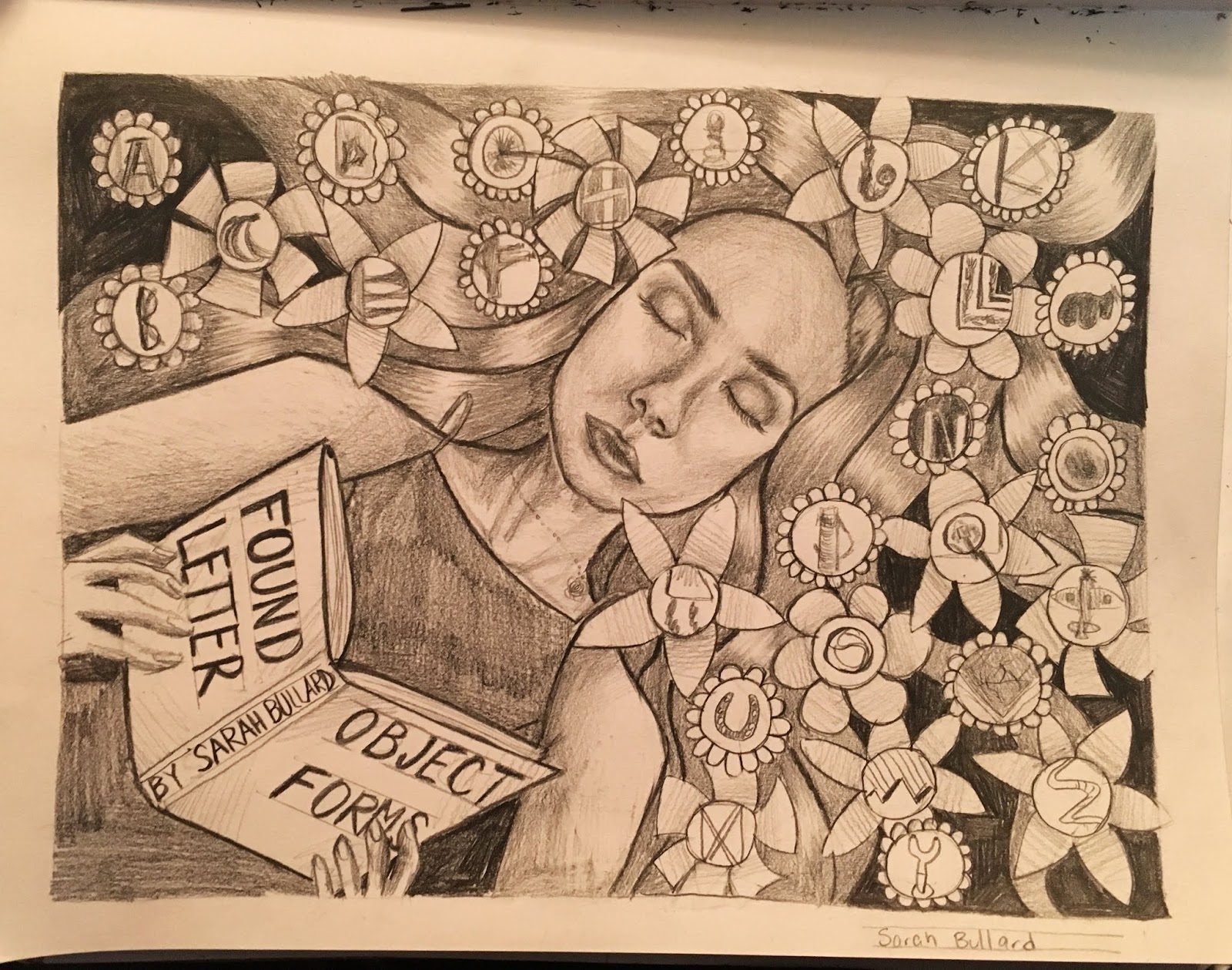
Today in class we begin conceptualizing a poster design which will show all 26 of your letterforms in a creative, non-grid based framework. We begin by brainstorming ideas for either a vertical or horizontal format poster. Four thumbnails are to be completed in class or as soon afterwards as possible. Include some indication of values (shading) and the title "Found Object Letterforms by (Your Name)".

Here are a few examples of what your thumbnails should look like:


I will give you feedback on which concept has the most potential so you can begin working on a full page comprehensive sketch, which should be completed by the time we get to class in Week Three.

Here's what your comp should look like:


In class during Week Three I will hand out large sheets of paper which you will use to render the final version of your poster design.

Here's an example of what your full size final poster should look like:


You'll begin working on the final in class in Week Three and discuss how much time we'll be devoting to completing the final over the next few classes.

Monday, July 2, 2018

CC2, Week 8: Herb Lubalin's 'Type - O - Graphics'

Here's a short video about a graphic designer you should know: Herb Lubalin

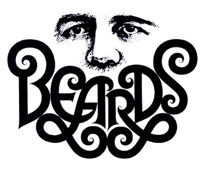
Herb Lubalin was famous for designing what he called "typ-o-graphics" - designs that combined type and art in clever, conceptual ways. For example...

Beards

Next, have a look at this blog post by graphic designer Frank Chimero

You'll be sent a link to a Excel file - choose which line you'd like to interpret as a Herb Lubalin-style typ-o-graphic and type your name in column 1 to claim that line. Only one person per line.

In class, use what we've learned about composition to create four thumbnail sketches of different ways to could interpret your line with both type and visual elements.

Next Week ISA #2: We will not be meeting in class next week. Choose one of your thumbnail sketches and create a finished version in ink wash. 


Monday, September 18, 2017

Drawing Basic Shape Cartoon People


This Week's In-Class Assignment

Begin as always by drawing a one-inch border.
Draw a horizontal line across the page 1/2 inch down from the top border. Draw a second horizontal line to create a one inch deep horizontal column. Draw six 1" x 1" squares in the column, equally spaced. Draw six circles in the six squares. using a very light dotted line, divide the circles in half horizontally. Draw two equally spaced dots on the centre line. Draw a line halfway between the two dots and the bottom of the circle. Make this line the same width as the distance between the two dots. Now try some variations, but always keep the two dots on the centre line and the "mouth" halfway between the dots and the bottom of the circle. Add eyebrows in different positions. Draw a second row as shown. Draw six more heads with different expressions, but add a different nose to each face. Complete the rest of the page as shown. You can drag the jpeg in this post to your desktop and print it out to use as a template.

This Week's Sketchbook Assignment

Use the construction technique from our in-class drawing exercise this week to sketch a group of four people. I chose me and my family. I started with myself, since I'm the tallest in my family, so by sketching the tallest person first, I establish how much space will be used on the page.
Notice that I extended my guidelines across the page. Not everyone in my family is the same height, but those lightly drawn guidelines will help me find their relative height. Next I drew my wife. I started with the square for the head and placed it so I established her height relative to mine.
Next is my oldest son, who is in university. He's taller than his mom, but not as tall as me. As you draw each character, add the little touches that make each character unique. Hair styles, clothing, accessories - all these thing and body language and facial expressions help define each character.
Finally I dre
w my youngest son, who is nearly as tall as me and also an artist (so I gave him a pencil and sketchbook). You can draw any group of four (or more) people, but make sure they are all on the same baseline.

For those of you interested in seeing more of Robin Davey's work, here's the link to his website.

Monday, September 11, 2017

Sketchbook Assignment #1

Find a spot somewhere outside with a flat-on view of the college buildings and sit down with your sketchbook. You may have to move back quite a ways to get a good view of the various buildings and surfaces. Do NOT choose a corner location where you are viewing two sides of the building. Spend an hour sketching the various geometric shapes that comprise the college, as well as any incidental elements (cars, trees, etc.) that you see.
Pay close attention to the contrast of values (light and shade) that you see in the scene in front of you and do your best to capture those contrasting values accurately.

Wednesday, June 7, 2017

Week 8: ISA#2

Here's a can of kid's pasta I designed...


Here's what the linear looked like.


Download the linear and print it out. Lay a new sheet of paper over it and sketch the dimensions. Your image area should be roughly proportional to 7.5" x 3.5"

Design a label for a kids pasta of your own. You may use any subject matter that appeals to you but do not simply redesign an existing label you found on the Internet or at the store. You may come up with your own character or characters or use an existing property - but do not choose a typical kid's cartoon property.

For instance, you could design "Breaking Bad" pasta or "Game of Thrones" pasta or "Grand Theft Auto" pasta.

Your design must include at least one figure (it does not need to be a full figure - you may crop or draw a close-up view), a close-up of a head, and a 2-point perspective environment. Notice that you must figure out a way for the environment to repeat at the two ends so that the scene appears continuous when the label is glued around the can.

Although it's not shown on my linear, you must include all typographic elements. Buy a can of kid's pasta at the store for reference of company logo, nutritional info, ingredients list, etc.

Make sure you include the title of your product and include all other type elements in your pencil linear.

Next week, upload a jpeg of one sketchbook page of rough, exploratory sketching in the Week #8 Sketchbook dropbox and place three jpegs in the ISA#2 Drop Box on eLearn: a photo of your hand holding a can of kid's pasta from the store or supermarket, one jpeg of your thumbnail sketches (as always do four or more thumbnail sketches) and one of your final pencil linear design. The drop box for late submissions of this assignment closes at the beginning of our normal class time during Week 9.

Please do not wait until the last minute to submit your files. Late submissions (after Week 8) will receive an automatic 20% penalty

Monday, April 10, 2017

Creative Concepts 1: Final ISA

You are designing a billboard for a local salon that offers Henna Tattoos. The subject of the design is the shop's Spring promotion.

The headline is "Spring Colours!"

Your billboard design must include the name of the shop, their logo, their phone number, website and street address. NOTE: We are simply using these shop names as a framework for the assignment. You should make up everything else if necessary. Create a fake logo, website address, etc. since they probably don't exist.

There are several salons in the Hamilton area to choose from at this link It doesn't matter if the shop is a real one, however, you can make up the shop name and info if you like).

Also include the line "Gift cards starting from $100"

Your visual elements must include (but are not limited to) one face (or part of a face) and two hands. You may include other parts of the figure or any other props, scenery, decorative elements that suit your design concept. Your design must include elements that suggest a Spring theme.

* I showed you some examples of work by Al Parker, Mike Ludlow and Dorothy Monet in class.

Submit the following:

A page of "Brainstorm Sketching" (show basic shape construction, stickman skeletons, facial proportioning, etc. as well as typographic exploration) as in the examples below.


This one page goes in the In-Class Sketches: ISA #3 Brainstorm Sketching drop box. Use the naming convention LPeng_Hennabrainstorms.jpg (replace my name with your own)

* NOTE: Meaningful exploration/sketching of typefaces/styles is also required to get full marks on this section.

Submit the first page described below to the Sketchbook 12 drop box. Use the naming convention LPeng_HennaThumbs.jpg (replace my name with your own):

A page of thumbnails (4 minimum) correctly oriented and the correct proportion for a billboard.


Submit the page described below to the ISA #3 drop box. Use the naming convention LPeng_HennaComp.jpg (replace my name with your own):

Your full-size pencil comp showing image area for a billboard-shaped ad, guidelines for all typography, construction for all visual elements.


Late submissions can be uploaded until 11:59 pm on the day we would nornmally have class during Exam Week, but will receive a 20% deduction.