Monday, March 3, 2014

Composition, Part 3 (CC2, Week 7)


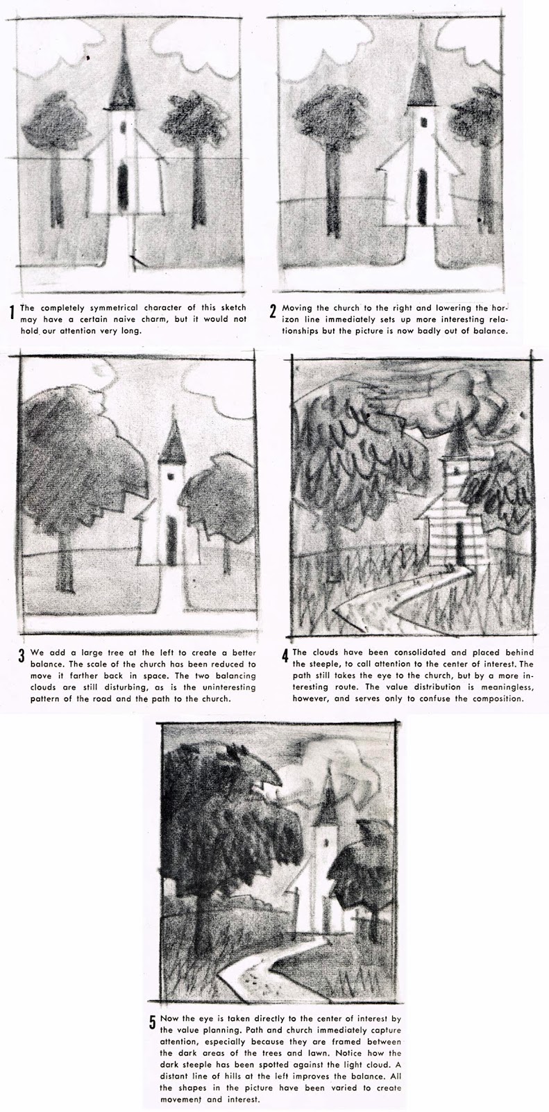
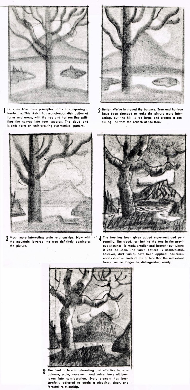
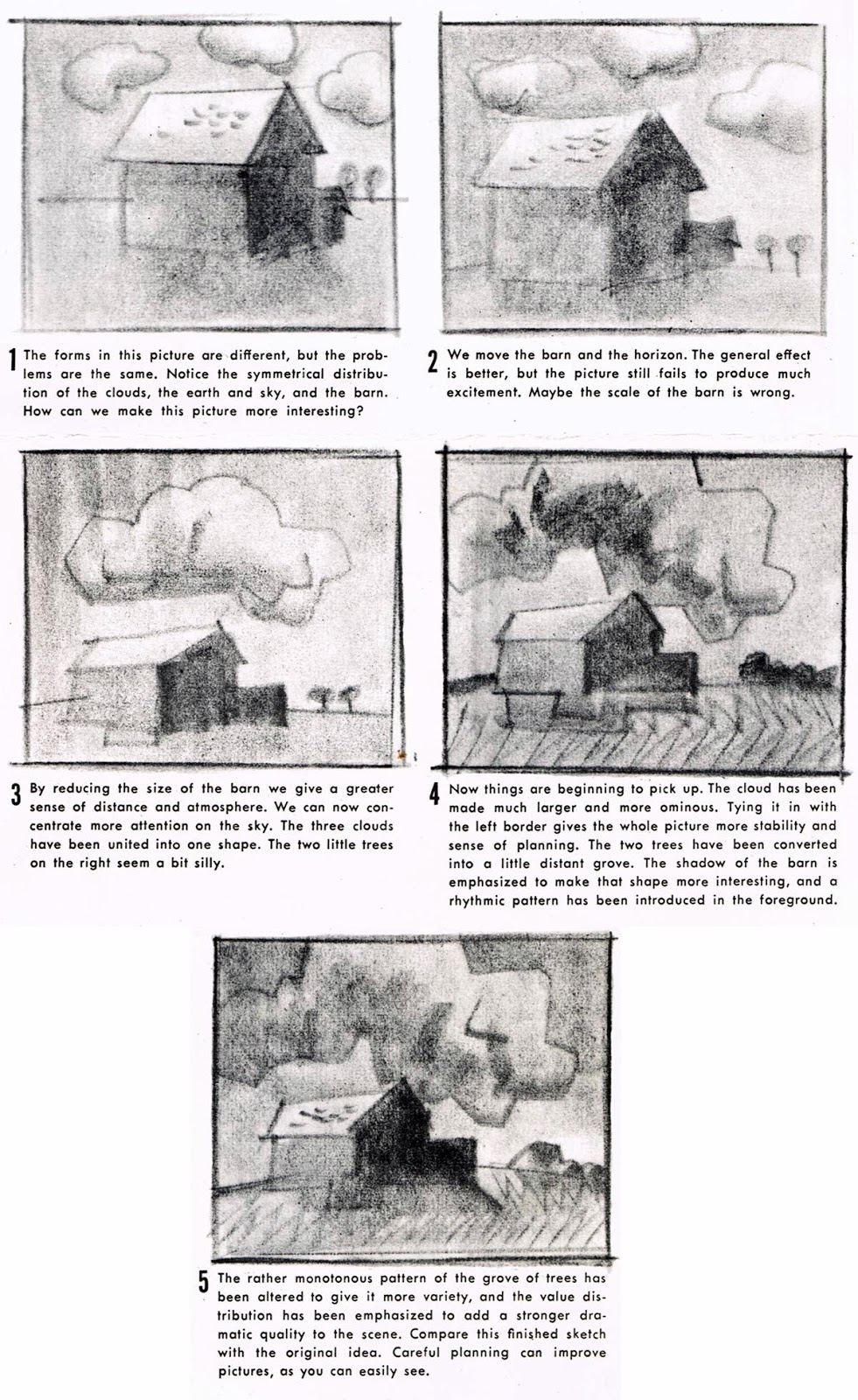
Turn your sketchbook to vertical format. Draw your 1" border and sketch five equal thumbnail shapes as indicated below. Read the paragraph under each example, then replicate the image. Use grey markers if you prefer.


On a new page sketch five equal thumbnail shapes as indicated below. Read the paragraph under each example, then replicate the image. Use grey markers if you prefer.


On the third page, sketch five equal thumbnail shapes as indicated below. Read the paragraph under each example, then replicate the image. Use grey markers if you prefer.


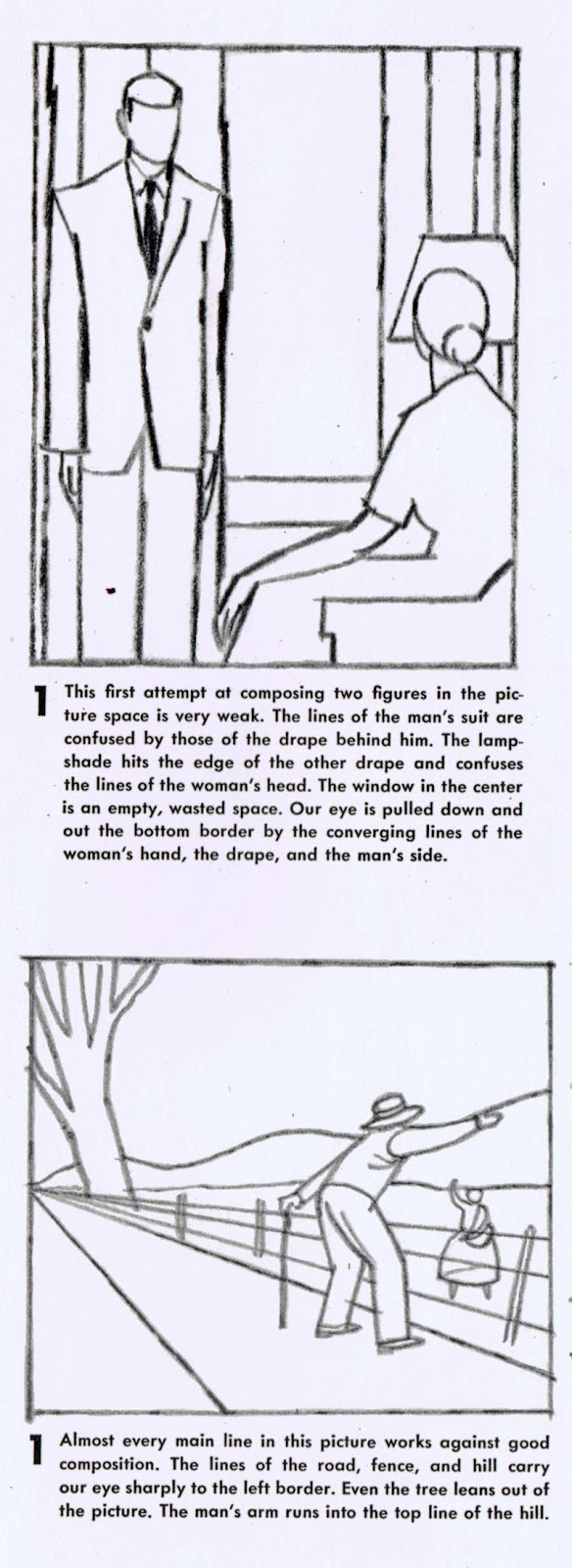
Choose only one of the two linear thumbnails below. Read the description explaining why the composition is weak. Redesign the composition, first by exploring possibilities by way of 4 small thumbnail sketches near the top of your sketchbook page, then by completing a larger sketch in the remaining space on the same page. Use values. You may make any adjustments you feel are needed to the positions and relationships of the figures in the composition (i.e. moving arms, legs, the distance between them, etc.) but keep in mind the implied interaction between the figures (i.e. they are looking at/talking to each other). Maintain that aspect of their interaction in some way in your redesign.


This week's sketchbook exercise:

Review the movie posters at this link, choose one and sketch it (roughly) in your sketchbook. Indicate with words, arrows, circles, and other shapes etc. why the poster you chose is compositionally working well.

Monday, February 17, 2014

Composition Part 2


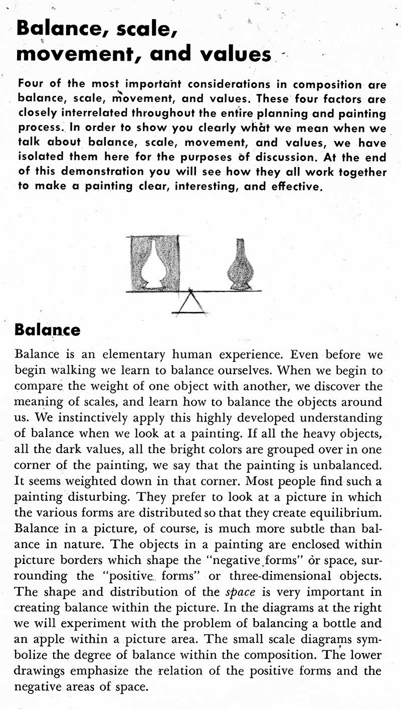
Instructions: Turn your sketchbook to vertical format. Sketch four thumbnail image areas. Study the image below. Thumbnail sketch it as is in the top left image area. Then, using what we've learned today, try reformatting it three other ways while maintaining the qualities of balance, scale, movement and values. You may add the grey values with your grey markers instead of shading with pencil if you prefer. 


This week's sketchbook assignment: choose three objects from around the house and arrange them in an environment. Sketch them in a composition that demonstrates all the strengths of balance, scale, movement and values. Include some typography in your design so the composition becomes the home page of a company or organization website. For instance, if you choose toiletries, it could be home page for Bed, Bath & Beyond... if you choose sports equipment it could be the homepage of the NHL or the Olympics.


Thursday, January 30, 2014

CC2, Independent Study Assignment #2

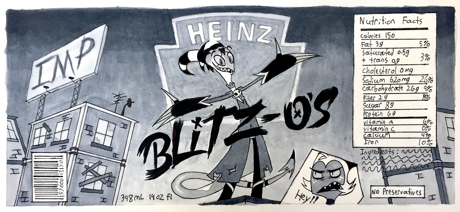
Here's a can of kid's pasta I designed...


Here's what the linear looked like.


Your image area should be roughly 7.5" x 3.5"

Design a label for a kids pasta of your own, but choose some sort of subject matter you would NEVER find on a kids pasta can label. Do not simply redesign an existing label you found on the Internet or at the store. You may come up with your own character or characters or use an existing property - even if it's not a typical kid's cartoon property.

For instance, you could design "Breaking Bad" pasta or "Game of Thrones" pasta or "Grand Theft Auto" pasta.

Your design must include at least one figure (it does not need to be a full figure - you may crop or draw a close-up view), a close-up of a head, and a 2-point perspective environment. Notice that you must figure out a way for the environment to repeat at the two ends so that the scene appears continuous when the label is glued around the can.

Although it's not shown on my linear, you must include all typographic elements. Buy a can of kid's pasta at the store for reference of company logo, nutritional info, ingredients list, etc.

Make sure you include the title of your product and include all other type elements in your pencil linear.

Note: we do not meet for class next week. Use our class time to do one page of brainstorm sketches:

... one page of four thumbnail sketches (indicate values):

... and one page of your final pencil comp (indicate values):

Use the following naming conventions: LPeng_PastaCanBrainstorms.jpg LPeng_PastaCanThumbnails.jpg LPeng_PastaCanComp.jpg (replace my name with your own)

Here are few more examples of well done assignments by students in a previous year:


Please do not wait until the last minute to submit your files. Late submissions (one additional week) will receive an automatic 20% penalty

Tuesday, January 28, 2014

Week Five Independent Study Assignment (Semester 1)


Once you've selected a cereal box from your Google Image search, open it in Photoshop. Use Image>Mode>Grayscale to remove the colour.


The window below will appear. Click 'Discard'.


After converting to Grayscale, you may need to adjust the size of the image to fit on an 8 1/2 x 11 sheet of printer paper. Use Image>Image Size...


Change the Height to 10 inches. If "Constrain Proportions" is checked, the Width should adjust automatically. Make sure the Width is around 7 inches. If the Width is wider than 7 inches, reduce the Height to 9 instead of 10 inches.


Print out the existing cereal box cover and tape a sheet of tracing paper over it. Follow the instructions outlined in the News section on our eLearn course page.

Sunday, November 17, 2013

Drawing the (Adult) Head in Correct Proportion

This week we are drawing two pages, one showing the male head from front and side views...

...and one showing the female head from front and side views.


Begin with an 8 1/2 x 11 inch sheet of white paper turned horizontally in front of you on your drawing table. As always, draw (freehand) a 1" border all the way around the page and hand-letter your name between guidelines at bottom right.
Again, working only freehand, sketch a circle in the top LH quadrant of the page as shown. The exact size and placement isn't important. Just try to approximate what you see in this example. Lightly draw guidelines dividing the circle in half both vertically and horizontally.
Extend vertical guidelines down from both sides of the circle, allowing them to taper inward slightly as shown. Extend the centre guideline down as well. Using the half circle as a unit of measure, lightly mark a guideline below the circle so that you have three equal units in height. This is the total height of the head, from the top of the skull to the chin.
Lightly sketch in guidelines 1/3 of the way down from the top of each unit of measure as shown. Note that each guideline represents a landmark on the face, from the top of the head to the chin. Important:Note that the centre horizontal line of the circle if the brow line, NOT the eye line, which is 1/3 below the brow line. Also note the bottom of the circle is the bottom of the nose and that the mouth is 1/3 the distance to the chin - not halfway!
Here's a little trick: if you draw five equal sized ovals touching end to end across the width of the circle on the eye line, the second and fourth ovals are the correct size and shape for the eyes.
Lightly draw guidelines straight down from the centre of each eye to arrive at the corners of the mouth. This is how you establish the width of the mouth.
Since we are drawing a male head, do NOT draw the lips all the way around! Look at how I drew the line for the opening of the mouth and try to mimic it. Add just a sketchy line under the mouth. this represents the shadow under the bottom lip.
Draw a triangle from the centre point of the eye line to the corners of the mouth. point where the sides of the triangle cross the nose line (the bottom of the circle) represent the width of the nose.
Also note how I have drawn angled lines from the side guidelines at around the mouth line to complete the chin. On a male face, always use angled lines, not smooth curves.
Try to draw the nose in the manner shown. A dip in the centre, slight upwards curves for the nostrils, then curved verticals for the outsides of the nostrils.
Extend the eye and nose guidelines outward a bit at both sides of the head. This gives you the height of the ears. Draw a shallow "C"- shaped curve for the outside shape of the ear.
Try adding the interior ear lines as I've indicated. You can now heavy up the eyebrows 9use angular lines as shown) and the top lip and bottom lip shadow, also as shown.
Now extend all the horizontal guidelines across to the right side of the page.
To draw the head in side view as show at the top of this page, follow the instructions at this link, this link and  this link