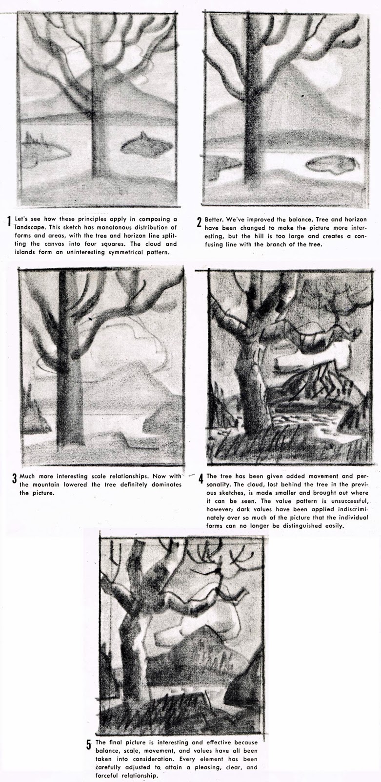
Turn your sketchbook to vertical format. Draw your 1" border and sketch five equal thumbnail shapes as indicated below. Read the paragraph under each example, then replicate the image. Use grey markers if you prefer.

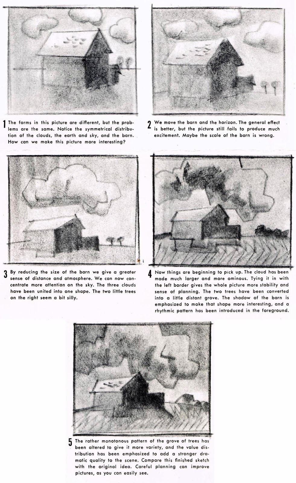
On a new page sketch five equal thumbnail shapes as indicated below. Read the paragraph under each example, then replicate the image. Use grey markers if you prefer.

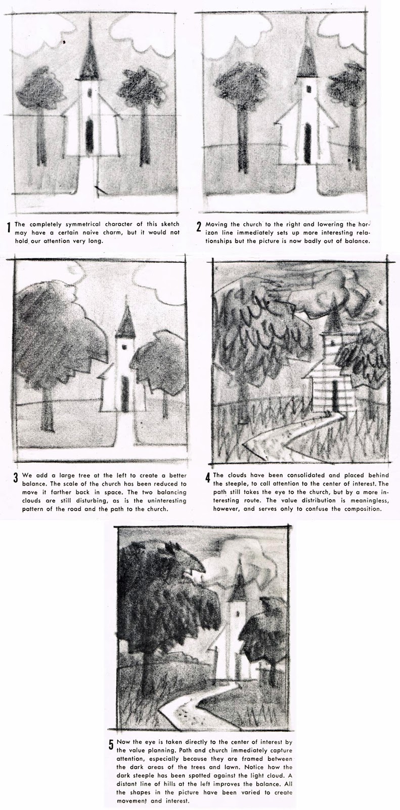
On the third page, sketch five equal thumbnail shapes as indicated below. Read the paragraph under each example, then replicate the image. Use grey markers if you prefer.

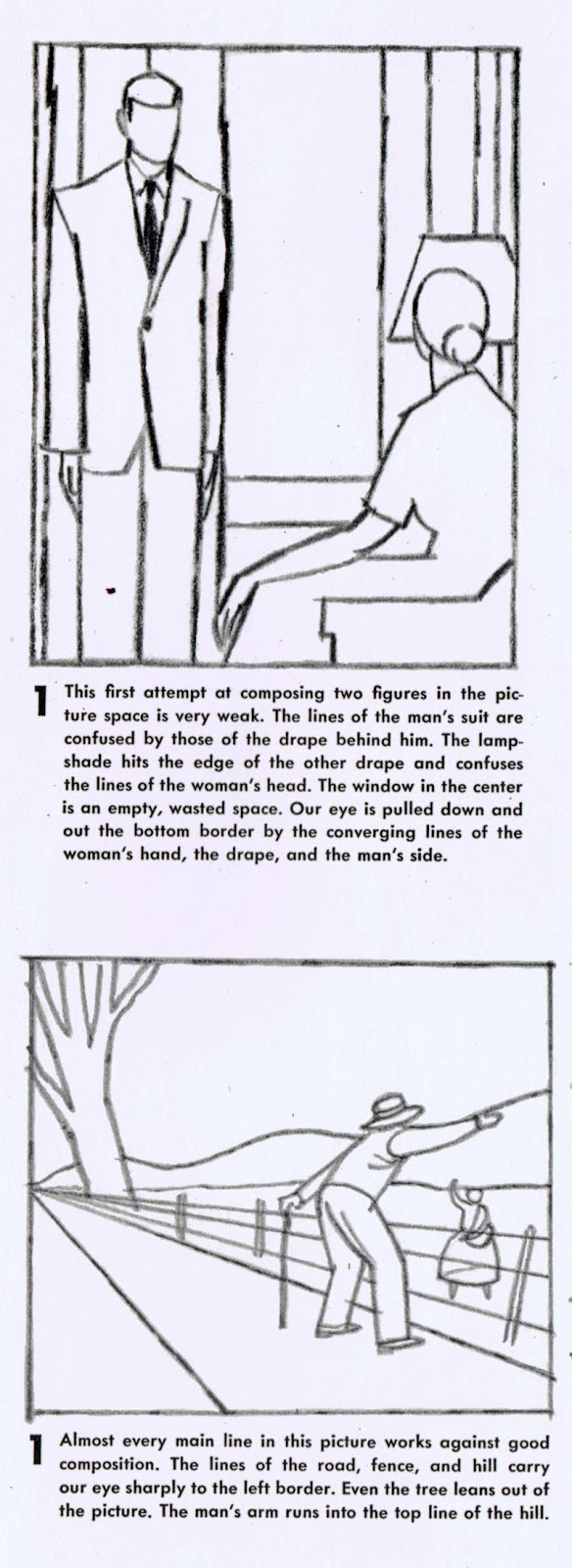
Choose only one of the two linear thumbnails below. Read the description explaining why the composition is weak. Redesign the composition, first by exploring possibilities by way of 4 small thumbnail sketches near the top of your sketchbook page, then by completing a larger sketch in the remaining space on the same page. Use values. You may make any adjustments you feel are needed to the positions and relationships of the figures in the composition (i.e. moving arms, legs, the distance between them, etc.) but keep in mind the implied interaction between the figures (i.e. they are looking at/talking to each other). Maintain that aspect of their interaction in some way in your redesign.

This week's sketchbook exercise:
Review the movie posters at this link, choose one and sketch it (roughly) in your sketchbook. Indicate with words, arrows, circles, and other shapes etc. why the poster you chose is compositionally working well.
No comments:
Post a Comment