This is a two-week assignment you will do on your own. We will not meet in class this week or next week.
You will need three sheets of 8 1/2" x 11" paper. Work either vertically or horizontally, but be consistent on all three pages.
Divide each page into nine equal spaces (to do so quickly, fold one sheet into thirds vertically, then again into thirds horizontally).
You may use a ruler to draw the grid that divides the space into nine equal sections.
Now look for man-made objects in your surrounding environment that contain letterforms. NOTE: Do not simply copy a letterform alphabet from the internet - any images copied from online sources will receive a zero.
Draw one letterform in each space. The first page should look something like this:
After drawing the object in line, use pencil shading or grey markers to add values to each letterform composition. Complete the first 13 letterforms this week and submit them to the drop box.
NOTE: Because this is not a typical in-class drawing exercise, you have all week to complete the first half of the alphabet. The drop box closes at the start of next week's class.
You can try reproducing these layouts by observation and calculation OR drag Layout Page 1 and Page 2 (below) off this blog to your desktop and print them out.
Each one should fit on an 8 1/2 x 11 sheet. Once you've printed them, you may use pencil or markers (or both) to reproduce them.
You can trace through the pages by using a light table, a glass coffee table with a small table lamp placed under it, or by taping the pages to a window.
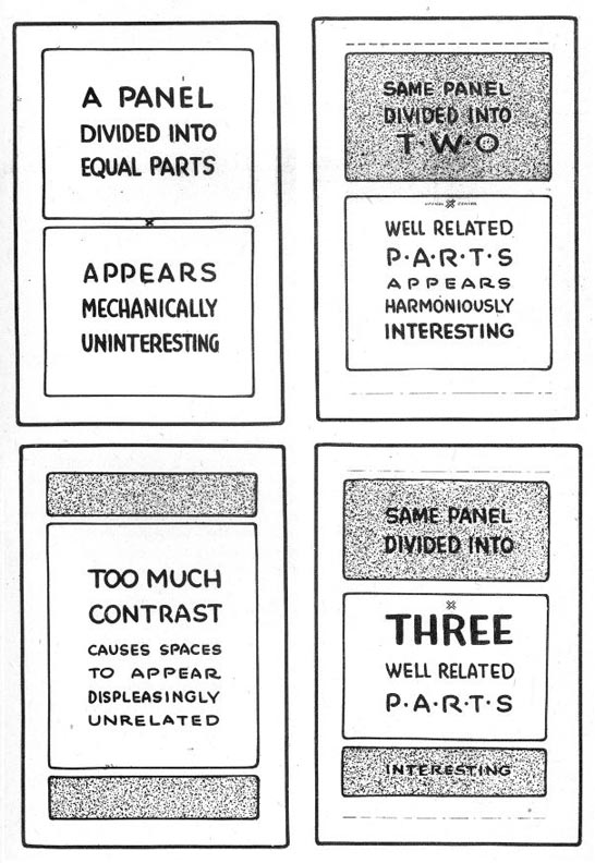
But don't just reproduce the exercises - study what they are telling you about how to organize a good vs. bad layout.
Due at the beginning of next Wedneday's class.
Week 3 sketchbook assignment: Choose any person (real or imaginary) and sketch their head in perspective in a layout includes the type of a magazine cover of your choice. For example, you could sketch your own face on the cover of TIME magazine or sketch a favourite video game character on the cover of Playstation magazine. NOTE: If you choose an imaginary character, you must do a "realistic" interpretation - not a cartoony version.
Due in the Week 3 Sketchbook Drop Box at 1 p.m. on July 21st.
Start by opening Photobooth on your MacBook and taking a photo of yourself. Try not to look straight into the camera. Tilt your head up or down a little and turn your head a bit to one side so we can see a bit of the profile of your nose.
Print out the photo on an 8 1/2 x 11 sheet of paper, tape a piece of tracing paper over the photo and start working on a construction drawing of the head as we learned in class this week.
Once you've completed the construction drawing using basic shapes and applying the rules of proper proportion to establish the location of the facial features and the planes of the face and head, tape a new piece of tracing paper over top and begin a clean line drawing on a new layer. Use both the construction drawing and the photo to help you draw this clean line artwork. DO NOT simply trace the photo!
Continue refining your line drawing...
When you're satisfied that you've completed enough of the line drawing to give you an accurate linear portrait sketch, scan or take a photo of the three layers and upload a jpeg to the Drop Box on eLearn. The sketch is due in the Dropbox Monday July 14th at 1 o'clock..
For this week's exercise you may use a ruler. I recommend you download the jpegs in this post, print them out and place a thin sheet of paper over them and trace each of the three exercises.
Complete all the pages at home and bring them to class to hand in at 11 a.m. on Wed. July 9th. If you don't have tracing paper, just use regular printer paper. Use a light table (if you have one) or a small light placed under a glass coffee table. In a pinch, a brightly lit window will do.
In each case, replicate as accurately as possible all the lines and letterforms in each of the three exercises.
Hour One: Draw the grid, then the letter forms on the same grid.
Hour Two: Draw the grid, then the letter forms on the same grid.
Hour Three: Although it's not shown below as it was in the two examples above, by now you should have the general idea: Draw the grid, then the letter forms on the same grid.
This week's sketchbook assignment (Due in the Dropbox on Monday July 14th at 11 a.m.):
Note: This assignment is handed in in person during our Week 14 class time. Late submissions will be handed in to the Late Submission Dropbox during Exam Week.
Here are some layout mock-ups of spreads from last year's Target Christmas catalogue...
You will design a spread for the Target Spring catalogue using an Easter theme. You may choose any subject matter that appeals to you (eg. food, electronics, clothing, etc.) using the 11" x 17" paper provided. You may design two pages side by side or a single image that crosses the gutter.
There are four sections to complete for this ISA...
Part 1: Rough sketching/exploratory drawing to be done in your sketchbook, due on the ledge at the start of class during Week 14.
Part 2: Thumbnails to be done on one side of the 11" x 17" paper provided in class during Week 13. (Minimum of three, with values and type indicated for marks - more than three for full marks - on this section).
Part 3: Finished comp to be done on the other side of the 11" x 17" paper provided in class during Week 13. Work with the paper in horizontal (landscape) position, draw the image area (1" border) and draw all visual and typographic elements neatly. Indicate values with either pencil shading or grey markers (or both). Render larger type elements - use greeking for smaller elements.
Part 4: Tape the thin layout bond provided in class during Week 13 over your finished comp and explain your design strategy using words, arrows, diagrams, etc.
Important: This assignment is due at the end of class time during Week 14. You do NOT have to work on it in class, however no assignments will be accepted in person after class time ends - late assignments must be placed in the Late Submission Dropbox on eLearn.
Choose a section that really speaks to you and sketch a layout design that demonstrates the lessons learned in today's in-class exercises. You may use both typography and visual elements of just typography - but use it creatively!
There are four pages to complete for this Independent Study Assignment...
Page 1 is your rough work page.
Use this page to explore the subject matter. Draw by constructing with basic shapes. To get full marks on this page you must demonstrate that you are drawing using basic shape construction and FILL the page with rough sketches, including sketches of typographic styles. NOTE: this page goes in the Week 14 Sketchbook Dropbox: ISA#3 Rough Work.
Page 2 is your thumbnail page.
Use this page to thumbnail four (or more) design compositions. You must use values by shading with pencil or grey markers (or a combination). However you do not need to do detailed drawing or render most of the typographic elements. Simple shapes that can be identified as type elements will suffice. Use the examples from last week's lesson as your guide. To get full marks on this page you must do at least 4 unique thumbnails compositions using values. NOTE:A composition that is just flopped or has the type moved from the top to the bottom does not qualify as a unique composition. NOTE: this page goes in the ISA#3 Dropbox.
Page 3 is your pencil comp page.
Choose your most effective thumbnail composition and do a large comprehensive sketch that includes values rendered in pencil shading and/or grey markers. Type elements should be rendered. That is, your type elements should roughly approximate the type style/face(s)/fonts you would use if you were eventually taking this project to finish on the computer. To get full marks on this page, you must complete Page 4 as well. NOTE: this page goes in the ISA#3 Dropbox.
Page 4 is your design justification page.
This is an overlay page to Page 3. Use a light table, a light placed under a glass coffee table, or tape your pages to a window. Use arrows, circles, boxes, diagrams and words to justify your design strategy. Demonstrate that you have applied the principles of good composition to create an effective design that moves the viewer's eye through the design and to the focal point. NOTE: this page goes in the ISA#3 Dropbox.
The Subject Matter: Start by watching this movie trailer:
The premise of the story is that by using the Rekall technology, you can be anyone you want to be - a super spy, a fashion model, a world class athlete, an astronaut - anything!
When the movie was about to be released, Columbia Pictures launched a viral marketing campaign. They hired a company to design fake advertising posters for Rekall - as though the service actually existed here and now in our time period - and plastered Los Angeles with them:
(Google Image Search "Rekall viral campaign" to see more designs)
Your job is to design a new viral marketing poster (same vertical proportions as shown above) for Rekall - but with some different parameters:
The headline on your poster will be...
BE THE YOU
YOU WANT TO BE
(You must break it into two lines as shown above, however you do not have to use all caps)
The subhead on your poster will be...
YOUR FACE
YOUR BODY
YOUR FANTASY
(You do not have to break it into three lines as shown above, you do not have to use all caps)
Your poster must include the REKALL logo in the font style shown on the actual posters above, incorporated in some manner according to how you choose to design it.
Your poster must include the URL rekall.com and may (but doesn't have to) include addition type like "Go to rekall.com for details"
There are three visual elements you must include in some design combination: a face and two figures of you, the person designing the poster - YOU are the subject in all three visual elements
Your poster must include your face, your body in your normal clothes, and your body in your fantasy outfit.
To better understand how a montage design of this sort works, look at movie poster designs:
The poster above cleverly combines a face (Colin Farell) and two smaller figures, along with some secondary visual elements. You may use secondary visuals if you like but they are not required.
NOTE: there is a total of 14 required words in your poster design -- there are 14 words in the movie poster design above in the block of type that includes the names of the stars and the title "Total Recall" and "Is it real Is it Recall" -- so you should have no problem incorporating all the type required in your design.
I strongly encourage you to do more research of how movie posters use montages of faces and figures and apply that design strategy to your poster. Go to Google Image Search and search "movie posters" for many examples.
If you have any questions, email me or post your question in the Facebook study group and tag me.




_2013-7.jpg)
_2013-9.jpg)
_2013-15.jpg)


