Note: This assignment is handed in in person during our Week 14 class time. Late submissions will be handed in to the Late Submission Dropbox during Exam Week.
Here are some layout mock-ups of spreads from last year's Target Christmas catalogue...
You will design a spread for the Target Spring catalogue using an Easter theme. You may choose any subject matter that appeals to you (eg. food, electronics, clothing, etc.) using the 11" x 17" paper provided. You may design two pages side by side or a single image that crosses the gutter.
There are four sections to complete for this ISA...
Part 1: Rough sketching/exploratory drawing to be done in your sketchbook, due on the ledge at the start of class during Week 14.
Part 2: Thumbnails to be done on one side of the 11" x 17" paper provided in class during Week 13. (Minimum of three, with values and type indicated for marks - more than three for full marks - on this section).
Part 3: Finished comp to be done on the other side of the 11" x 17" paper provided in class during Week 13. Work with the paper in horizontal (landscape) position, draw the image area (1" border) and draw all visual and typographic elements neatly. Indicate values with either pencil shading or grey markers (or both). Render larger type elements - use greeking for smaller elements.
Part 4: Tape the thin layout bond provided in class during Week 13 over your finished comp and explain your design strategy using words, arrows, diagrams, etc.
Important: This assignment is due at the end of class time during Week 14. You do NOT have to work on it in class, however no assignments will be accepted in person after class time ends - late assignments must be placed in the Late Submission Dropbox on eLearn.
Tuesday, April 1, 2014
CC2, Week 12: Sketching Type in a Layout
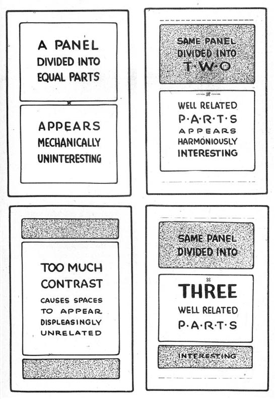
In your sketchbook, reproduce these layouts by observation and calculation.
Draw only two per page, leaving room to then sketch corresponding examples of the layout description.

But don't just reproduce the exercises - study what they are telling you about how to organize a good vs. bad layout.
Due at the end of today's class.
This week's sketchbook assignment: Read Frank Chimero's Advice for Graphic Design Students
Choose a section that really speaks to you and sketch a layout design that demonstrates the lessons learned in today's in-class exercises. You may use both typography and visual elements of just typography - but use it creatively!
Draw only two per page, leaving room to then sketch corresponding examples of the layout description.

But don't just reproduce the exercises - study what they are telling you about how to organize a good vs. bad layout.
Due at the end of today's class.
This week's sketchbook assignment: Read Frank Chimero's Advice for Graphic Design Students
Choose a section that really speaks to you and sketch a layout design that demonstrates the lessons learned in today's in-class exercises. You may use both typography and visual elements of just typography - but use it creatively!
Subscribe to:
Comments (Atom)
_2013-7.jpg)
_2013-9.jpg)
_2013-15.jpg)
