Wednesday, January 6, 2021

Creative Concepts 1, Week 1: Sketching lines, grids, and understanding alignment

Here's the sketch we worked on together in class today. Your in-class sketch should look something like this.
Photograph this page with your phone held flat, directly above and under bright light. The photo should be cropped tight so very little of the surrounding table top is in the shot. Please save this photo as a .jpeg file (.pdf or .png are also OK) - but please do not submit iPhone native files (.HEIC).
Rename your file before uploading it using the naming convention LPeng_CC1WK1_InClassSketch.jpg (replace my first initial and last name with your own). You have until 11:59 pm of the night of our class to submit this file to the Week One In-Class Sketches dropbox on Canvas.
Week 1 Sketchbook Assignment:
Take a look outside at nearby architecture. It could be a house, apartment, commercial or other type of building. Take a photo of the flat front of the building and sketch everything, paying attention to the alignment of doors, windows and other features on the flat surface. Sketch any other interesting elements in the scene (i.e. trees, lawn, bushes, parked cars, etc. Try adding some clouds in the sky to complete your sketch. Here's an example of a successful sketch by a previous student:
Photograph this page with your phone held flat, directly above and under bright light. The photo should be cropped tight so very little of the surrounding table top is in the shot. Please save this photo as a .jpeg file (.pdf or .png are also OK) - but please do not submit iPhone native files (.HEIC).
Rename your file before uploading it using the naming convention LPeng_CC1WK1_Sketchbook.jpg (replace my first initial and last name with your own). You have until 9:00 am on the day of our next class to submit this file to the Week One Sketchbook Sketches dropbox on Canvas.

Monday, November 9, 2020

ISA #2, Design a Character Concept Art Page

For your 2nd Independent Study Assignment, we'll apply what you've learned about sketching the figure and head to a character concept 'style guide' page. This type of artwork is commonly used in the film and television, video game and animation industries.It usually shows the character full figure, as well as showing their head close up from front and side views. Here's an example of a typical style guide page:
We will use the video game development assignment you did for Mitch's course as a springboard for your character concept sketch. Choose a character from the video game you are developing for Mitch. If the game characters are very cartoony (i.e. do not have realistic human proportions) then you will need to redesign them into realistically proportioned characters. For example, if you chose a game like Super Mario, your characters should reflect the proportions of the humans who played the characters in the Super Mario movie.
Your assignment has three parts, which should each be sketched on their own page. 

Part One: Brainstorm sketching Fill the page with sketching related to the subject matter of the assignment. Try sketching your initial ideas for several different characters from your game. Think about the typography you will incorporate in your page design and try sketching some stylized letterforms, think about and sketch props, environments etc.
This is your 'In-class' sketch assignment for this week. Go to the dropbox for naming convention information. 

Part Two: Thumbnail Designs for Your Character Concept Page Character concept pages are organized in many different ways depending on who is the designer and what the creative team on the project requires. In this case, you must include a minimum of one full standing figure and two heads; a front view head and a side view head. However, you are more than welcome to include additional figures, partial figures and or heads, as well as any props relevant to that character (eg. a weapon they carry). Create four thumbnail sketches on one page showing four unique ways you can organize your page elements. Google "character concept page" to see countless variations you can use as inspiration.  

IMPORTANT: your page must include the game title and a short description next to each visual element (eg. "Front view of head" or "Side view of head" or "Relaxed standing pose") Remember to sketch guidelines above and below all your letterforms!
The thumbnail sketches goes in the the Sketchbook Dropbox. Go to the dropbox for naming convention information. 

Part Three: Your Final Character Concept Page Choose one of your four thumbnail sketches and develop it as a full page, comprehensive drawing. If you plan to add colour, take a photo before you colour the page. You can submit both versions, but the b/w version is the one I will be marking. Leave all construction lines visible for the face and the figure on the b/w version. You can erase them in the colour version if you like. here are a some examples of successful pages created by the last class of students:
The comp goes in the ISA #2 Dropbox. Go to the dropbox for naming convention information.

Monday, December 3, 2018

ISA #3: Tattoo Shop Billboard

You are designing a billboard for a local tattoo shop: Hamilton Tattoo Parlour

The billboard is promoting a $100 gift certificate as a Christmas gift idea.

The headline "Christmas Decorations" must be included in your design, along with the name of the shop, their logo, their address, phone number and website URL.

Your design must include all or part of the face, figure and hands. Also consider what kind of decorative elements you can incorporate that suggest "Christmas". Last year the theme was 'Hennah Tattoo Salons' so these examples are not exactly the same as what you'll be doing (these students weren't required to show the figure - just face and hands)but you may still find these helpful:


Important: Remember that you are designing a billboard, a horizontal rectangle that is not the same proportion as your sketchbook page, so you cannot just come in one inch from the edge of the page when you sketch the image area. Google "billboard templates" and look at the typical shapes of billboards and choose one that looks like most billboards we see around Hamilton. Some of the examples above were not billboard-proportioned and subsequently lost marks.


There will be three pages of sketches to complete...

1.) A page of brainstorming sketches (goes in the Week Fourteen Sketchbook dropbox, file name: LPeng_ISA03_Brainstorms.jpg*).

2.) A page of four thumbnail sketches (goes in the ISA #3 dropbox, file name: LPeng_ISA03_Thumbnails.jpg*).

2.) A full page comprehensive sketch (goes in the ISA #3 dropbox, file name: LPeng_ISA03_Comp.jpg*).

*Substitute your name for mine in the file name)

All three pages are due in their correct dropbox at what would be the end of our regular class time during Week Fourteen (Exam Week).

We will not be meeting in class during Exam Week.

Creativity is key to getting a high mark. Think creatively about your billboard concept! To inspire you, here are a few examples of designs that use hands and faces in very creative and unexpected ways:


Monday, November 12, 2018

CC1, Week 11: ISA #2

Your second Independent Study Assignment will take place next week, however you can begin immediately if you prefer. It would be advisable to not wait until that day to begin! NOTE that we do not meet in class during an Independent Study Assignment.

The assignment is to redesign the cover of an existing video game. Your new design must incorporate a montage of figures and heads. For example, here is an existing video game cover...


There are four parts to your 2nd Independent Study Assignment:

1.) a page of rough, exploratory sketching (Goes in the Week 11 Sketchbook dropbox. Naming convention (replace my name with your own): LPeng_ISA02_BrainstormSketches)


2.) a minimum of four thumbnails (goes in the ISA #2 dropbox. Naming convention (replace my name with your own): LPeng_ISA02_ThumbnailSketches)


3.) a full size pencil comp (Goes in the ISA #2 dropbox. Naming convention (replace my name with your own): LPeng_ISA02_Comp) NOTE that the design is now a montage of figures and heads.


4.) a jpeg of the actual existing video game box cover, as shown at the top of this post. (Goes in the ISA #2 dropbox. Naming convention (replace my name with your own): LPeng_ISA02_ExistingDesign)

To earn marks you must submit all pages to the correct dropbox(es) PLUS the existing image - four files all together - in .jpeg or .png format only - do NOT zip your files. Files submit to the wrong dropbox will get a zero. Reread these instructions carefully before uploading!

Remember:

* Draw the image area to the correct proportion.

* Draw guidelines for all typographic elements.

* Leave construction lines in place so I can tell you are using the stickman construction method when drawing figures and the proportion method when drawing faces.

Monday, October 29, 2018

Week Eight: Drawing the Head in Proportion

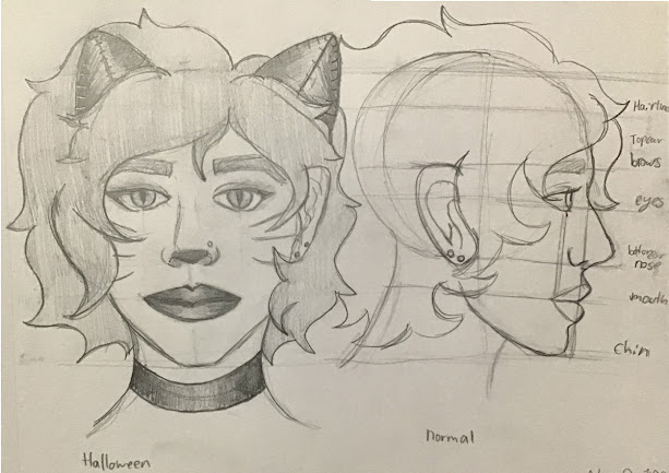
Your in-class (work-at-home) exercise for this week is to complete sketches of the human head in correct proportion. Your finished sketches should look like this:


Please use the naming convention(replacing my name with your own) LPeng_MaleHeadSketch.jpg (or .png)


Please use the naming convention(replacing my name with your own) LPeng_FemaleHeadSketch.jpg (or .png)

You can choose your own hairstyles for both these sketch pages.

To learn how to construct the human head like I did in these sketches, first watch this short video on drawing the head from a front view (ignore the instructors direction to watch the Part One video).

Then watch this second short video on drawing the head from a side view.

Follow the instructor's step-by-step process to complete your two sketch pages.


This Week's Sketchbook Assignment:

Sketch your own head using the construction method - one front view and one side view. Take a photo of your sketch with all the construction lines still visible. Now add finishing details - but add Hallowe'en makeup to one of the view. 


Your Hallowe'en makeup can include modifications to hair (i.e. as a werewolf) and/or features (fake ears, nose, etc.) but should not be a full face-covering mask (like a Friday the 13th Jason hockey goalie mask, or a Spider-Man mask). A partial mask (i.e. Captain America, Batman) is OK. Take a photo of your sketch with all the construction lines erased. You may add colour and/or background to this version. Please use the naming convention (replacing my name with your own) LPeng_SelfPortrait_Halloween.jpg (or .png)

Tuesday, July 24, 2018

CC2 Major Project: Letterforms in Your Environment

This week you are to doing field research, finding and photographing letterforms in your environment. Each student should assemble all their letterform photos onto a single 8 1/2" x 11" page like this example:


Important: If you haven't completed this step it won't be possible to complete the work in the next several weeks. Your priority right now should be completing and submitting your photo sheet ASAP!

Today in class we begin conceptualizing a poster design which will show all 26 of your letterforms in a creative, non-grid based framework. We begin by brainstorming ideas for either a vertical or horizontal format poster. Four thumbnails are to be completed in class or as soon afterwards as possible. Include some indication of values (shading) and the title "Found Object Letterforms by (Your Name)".

Here are a few examples of what your thumbnails should look like:


I will give you feedback on which concept has the most potential so you can begin working on a full page comprehensive sketch, which should be completed by the time we get to class in Week Three.

Here's what your comp should look like:


In class during Week Three I will hand out large sheets of paper which you will use to render the final version of your poster design.

Here's an example of what your full size final poster should look like:


You'll begin working on the final in class in Week Three and discuss how much time we'll be devoting to completing the final over the next few classes.

Monday, July 2, 2018

CC2 Summer Session, Week 1: Herb Lubalin's 'Type - O - Graphics'

Hour ONE:

Note: We will NOT be meeting at 8 a.m. tomorrow. Do this on your own and come at 9 a.m. prepared to discuss and sketch based on your research.

Read this article about Herb Lubalin. Do further research into Herb Lubalin... I will be asking you to tell me something I DON'T already know about Lubalin. This will be worth 50% of your in-class participation mark for tomorrow.

Google Image Search Herb Lubalin's logo designs.

Look specifically for "Beards" , "Mother & Child" , "Families" and other Lubalin "typographics"

Beards

Begin thinking of potential words that you could design into a Lubalin - style 'typographic'. We will be working on sketching your typographics during hours Two and Three tomorrow!